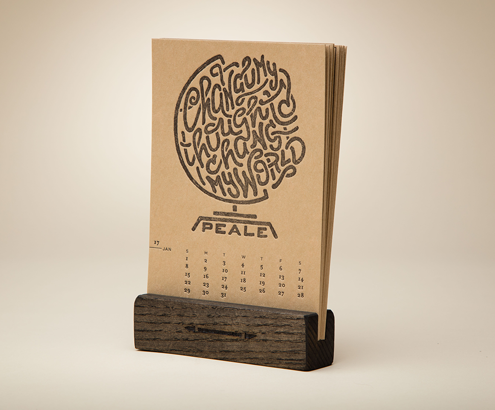
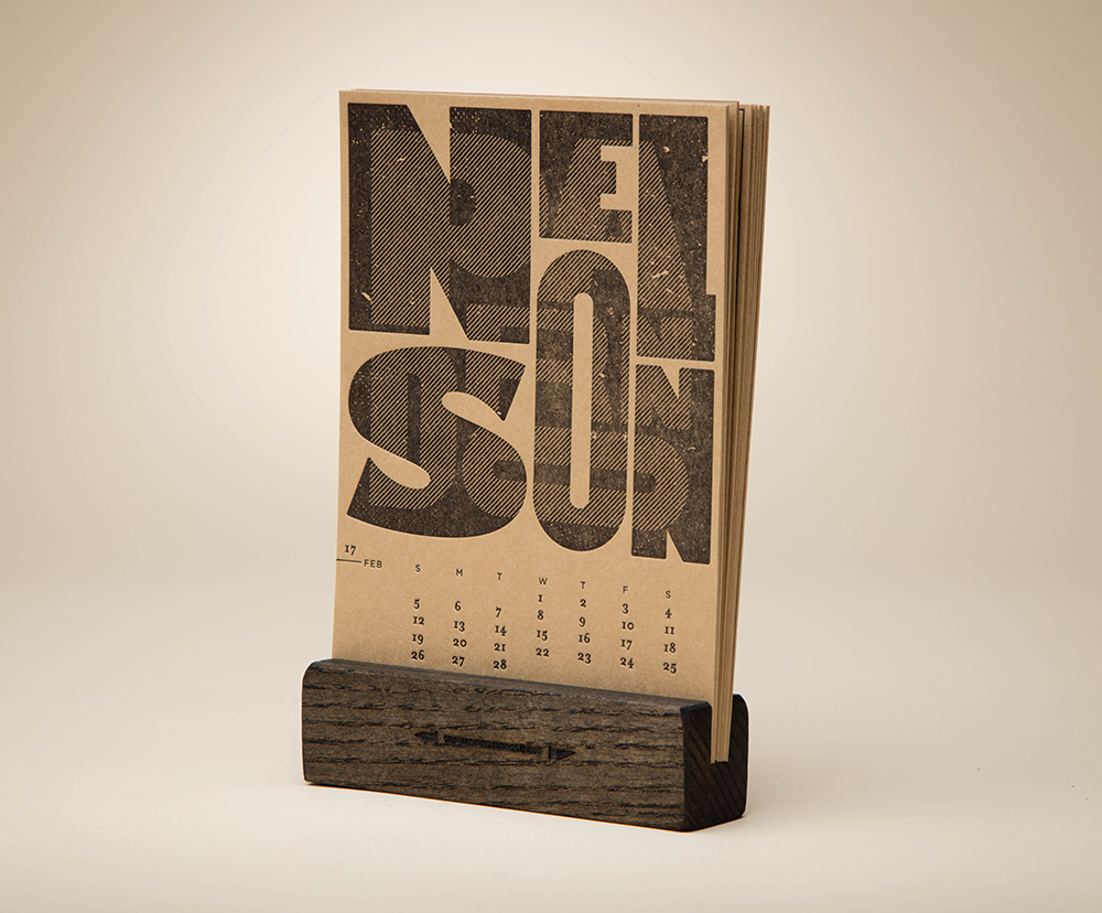
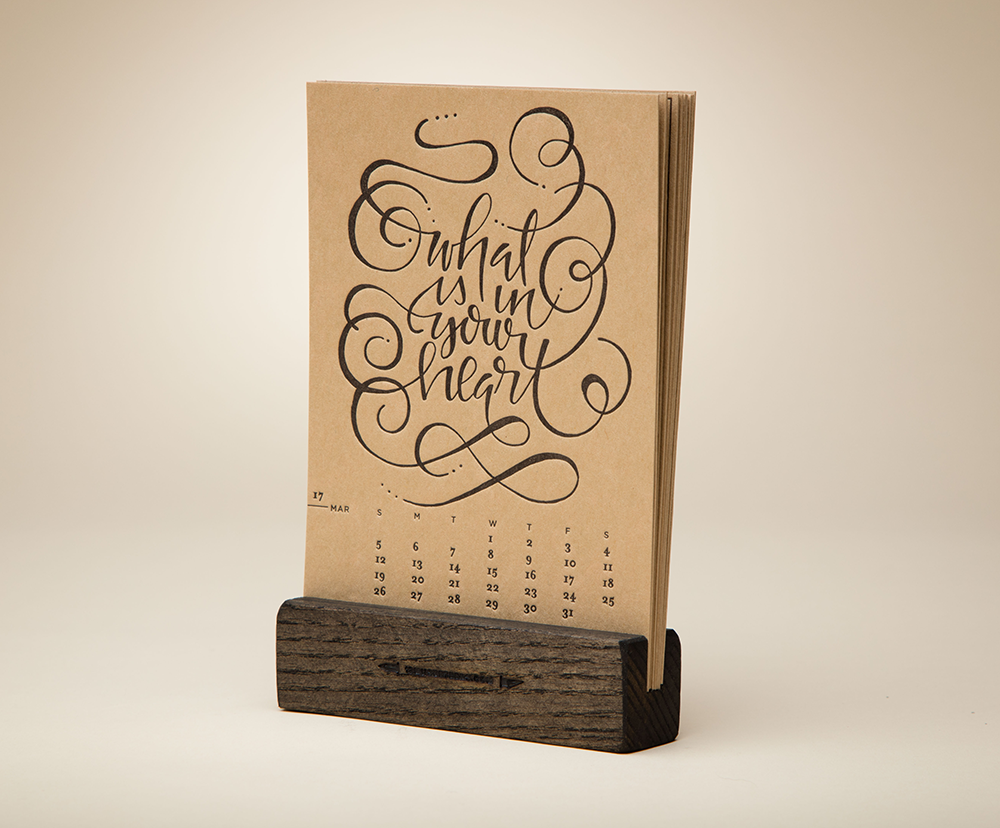
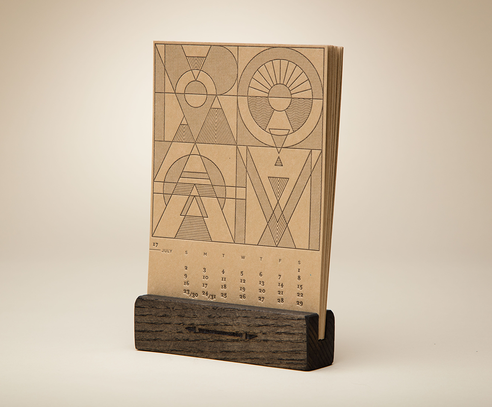

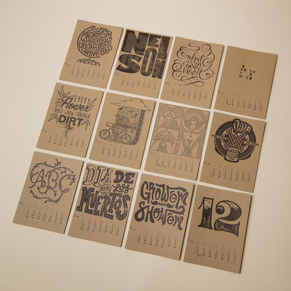
Twelve designers, created different hand printed pages for twelve months and the result is a fine letterpressed desk calendar standing on a hand cut wooden stand. You can order here.
Twelve designers, created different hand printed pages for twelve months and the result is a fine letterpressed desk calendar standing on a hand cut wooden stand. You can order here.
![]()
Nice floral logo and applications for a Chicago tattoo studio by designer, lettering artist & illustrator Kyle Letendre. The studio is strong on nature-focused work, hence the flowers.
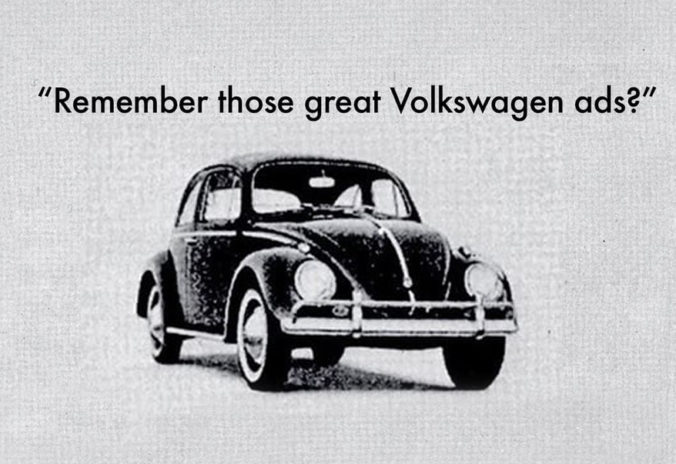
A delightful and insightful short documentary about the groundbreaking advertising campaign DDB created for Volkswagen, universally acknowledged to be the greatest and most influential of all time. At the time simplicity was the key, but this is why these ads are still so modern!
This is a film by British filmmaker Joe Marcantonio. His father Alfredo was the advertising manager of VW in the seventies and in 1982, he co-authored the book with the same title.
(via)
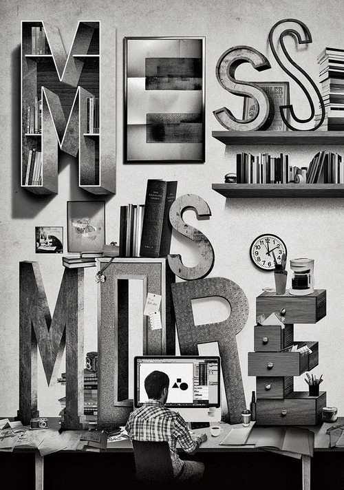
Mess is more: Illustration commissioned by Uppercase magazine

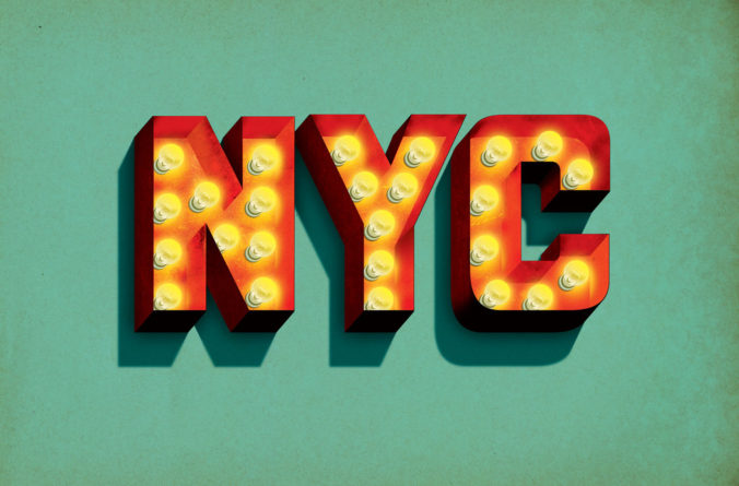
NYC in lights: Originally created for a design exhibition in Texas

Hot List: Illustration created for Conde Nast
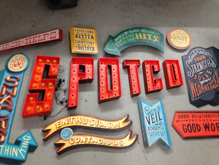
Spotco: Three-dimensional parts of a piece of lettering art for a company entrance
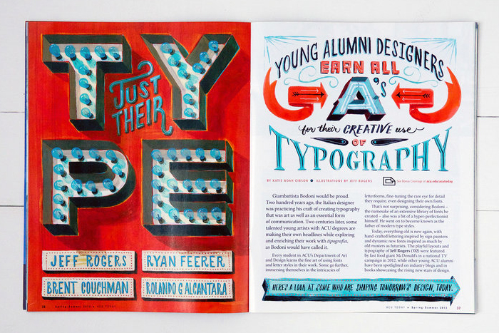
ACU Today: Lettering for editorial design
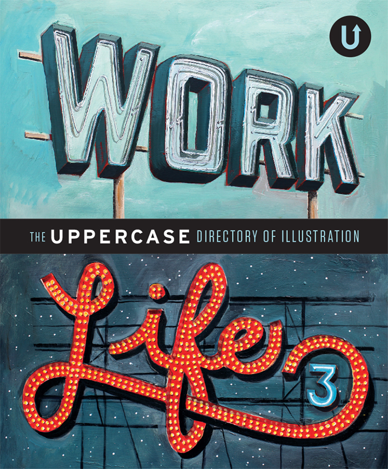
Work/Life: Cover illustration for a book
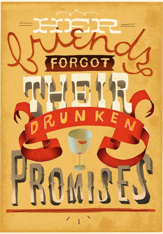
Lettering for a “story with 6 words”
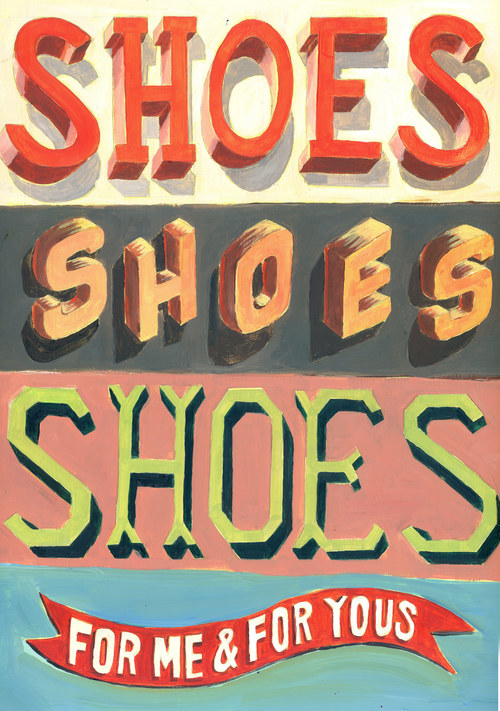
Shoes: Painting inspired by vintage dimensional type specimens
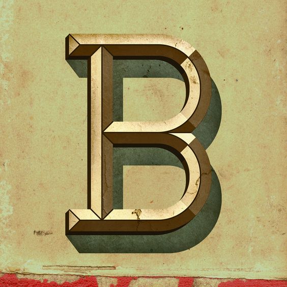
Letter B – inspired by vintage dimensional type specimens
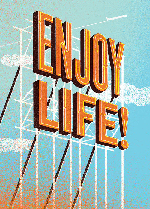
Enjoy Life: illustration created for a custom company book
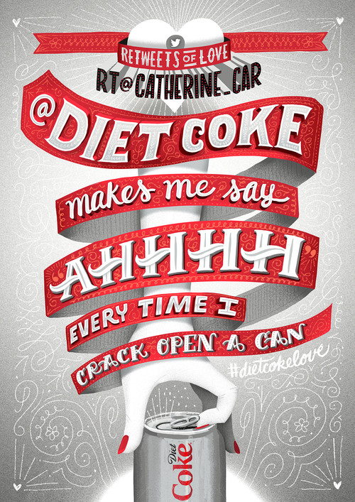
Retweets of love: Promotional design for Diet Coke
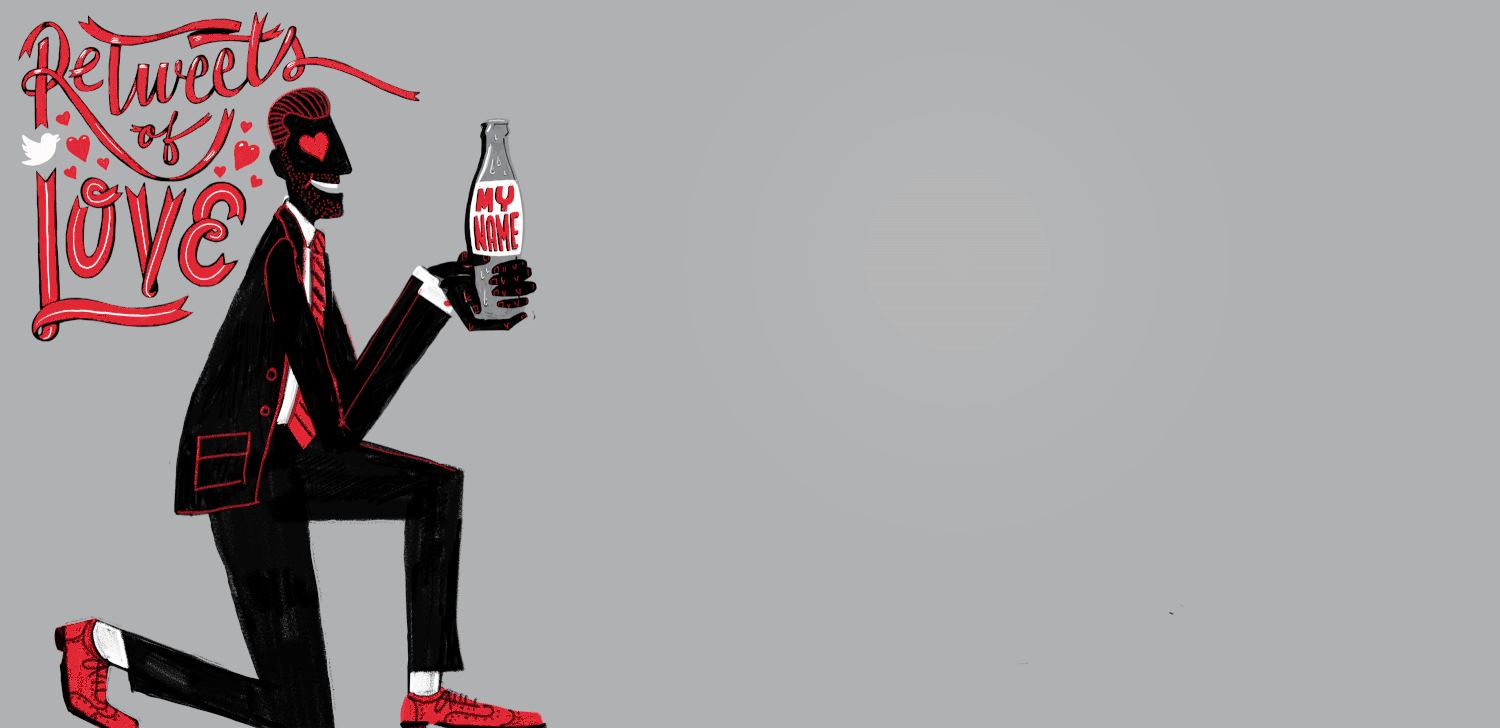
Retweets of love: Promotional design for Diet Coke
Wells Fargo Mobile Banking: A series of animations for social media.
Wells Fargo Mobile Banking: A series of animations for social media.
Wells Fargo Mobile Banking: A series of animations for social media.
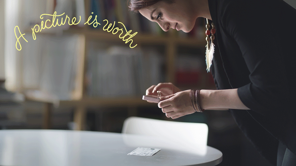
Wells Fargo Mobile Banking: A series of animations for social media.
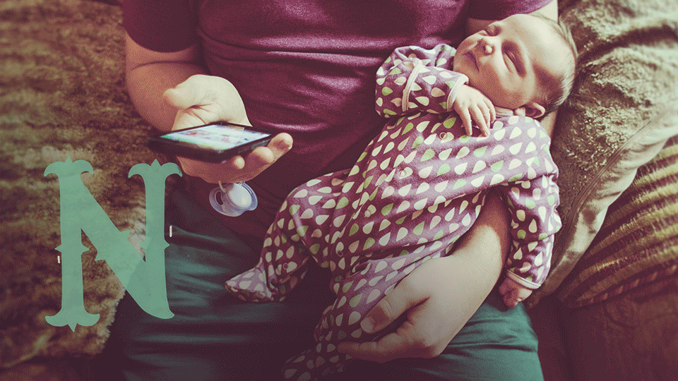
Wells Fargo Mobile Banking: A series of animations for social media.
Just discovered Jeff Rogers, a New York City-based designer and letterer. He has a very distinct style of lettering which I love! He uses a combination of hand-drawn and digital techniques depending on the project, while having a very broad range of styles in his work.
He usually begins with pencil sketches and then, often, moves on to the computer to make vector outlines and add texture and color. In other cases he draws or paints by hand, creating a beautiful retro style reminiscent of vintage painted signage. He also plays around with sculpted letterforms by creating three-dimensional handmade letters.
Also, really amazing work with the GIF animations!
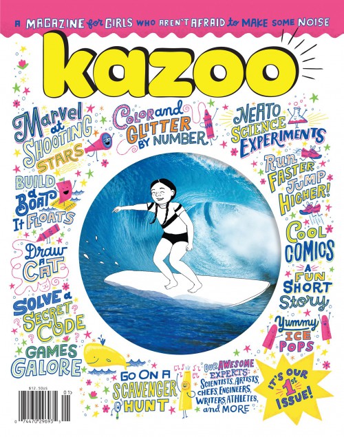
Now, this is something that combines my search for new and interesting ways to empower our young daughters to feel more confident of themselves, and also my love for design and lettering.
Kazoo is “a magazine for girls that inspires them to be strong, smart, fierce and, above all, true to themselves” as the creators say. In a time that TV and tablets are taking over the free time of young kids, it’s really encouraging to hear that a cool new magazine for girls aged 5-10 years is out. The founder, Erin Bried (a former magazine editor), thought of the concept out of the need to find a cool magazine for her daughter, that doesn’t only tell girls how to look or act. Bried launched Kazoo after a very successful Kickstarter campaign and the first issue was just printed this summer and is already sold out! All of their stories are either developed or inspired by top female artists, explorers, scientists, chefs, athletes, activists and writers. How inspiring is that for little girls?
Design wise for the first issue, Bried has used a selection of the best illustrators and letterers around. Mary Kate McDevitt has done all the lettering on the cover and some very nice lettering illustrations for inside. Illustrator and designer Libby Vander Ploeg has also created some beautifully illustrated maps. I can’t wait to look inside! I am thinking of subscribing for my daughters, but I will end up keeping the magazine for myself! Unfortunately the shipping costs from the US are too high, hopefully I will find a way!
(via) Thank you Tania!
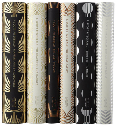
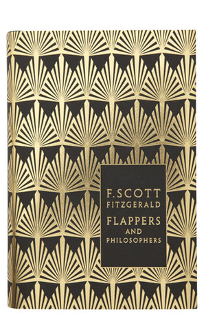
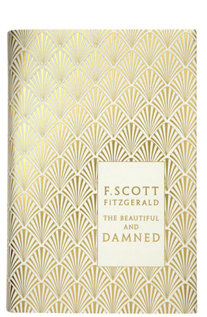
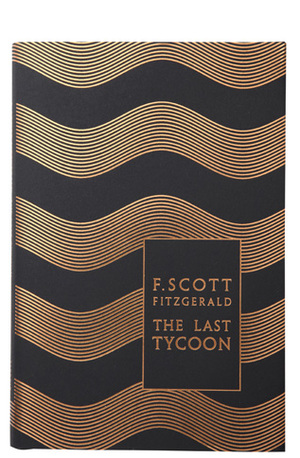
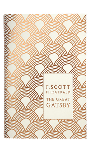
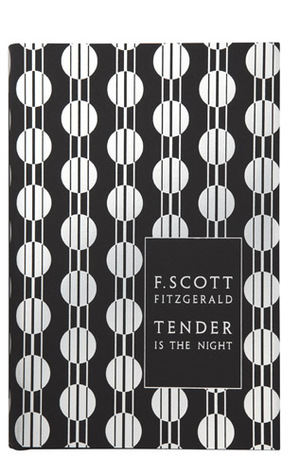
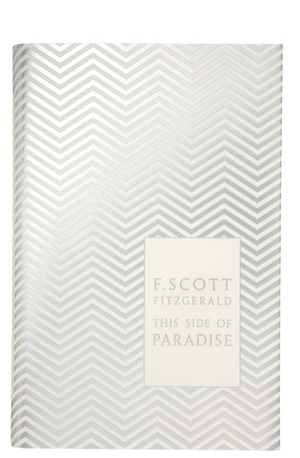
I discovered the enchanting work of book designer Coralie Pickford-Smith recently.
The above selection is the exquisite series for F. Scott Fitzgerald’s book covers for Penguin Classics, one of the many beautiful series she created, drawing inspiration from the Art Deco period, combined with metallic foil printing on matt paper.
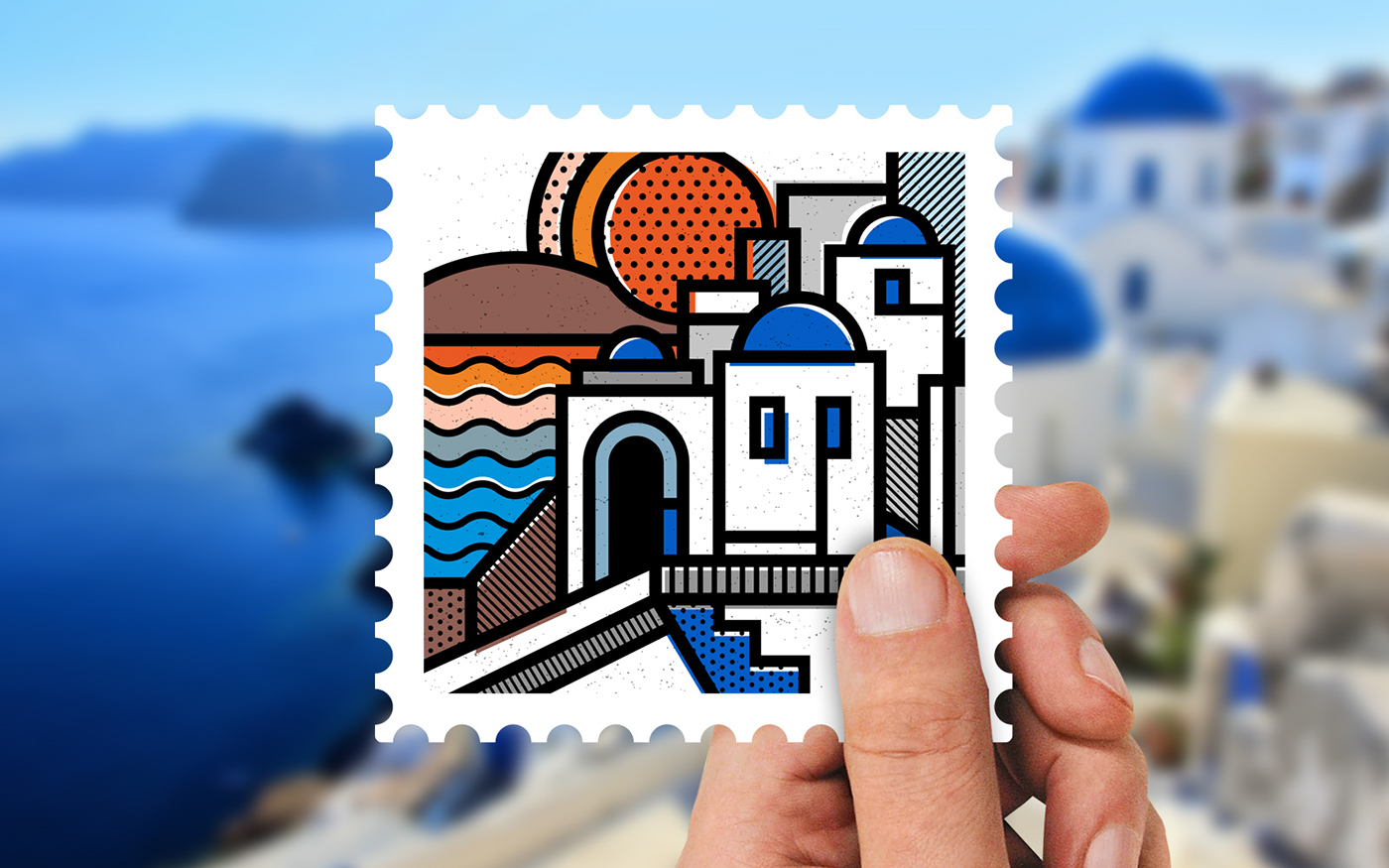
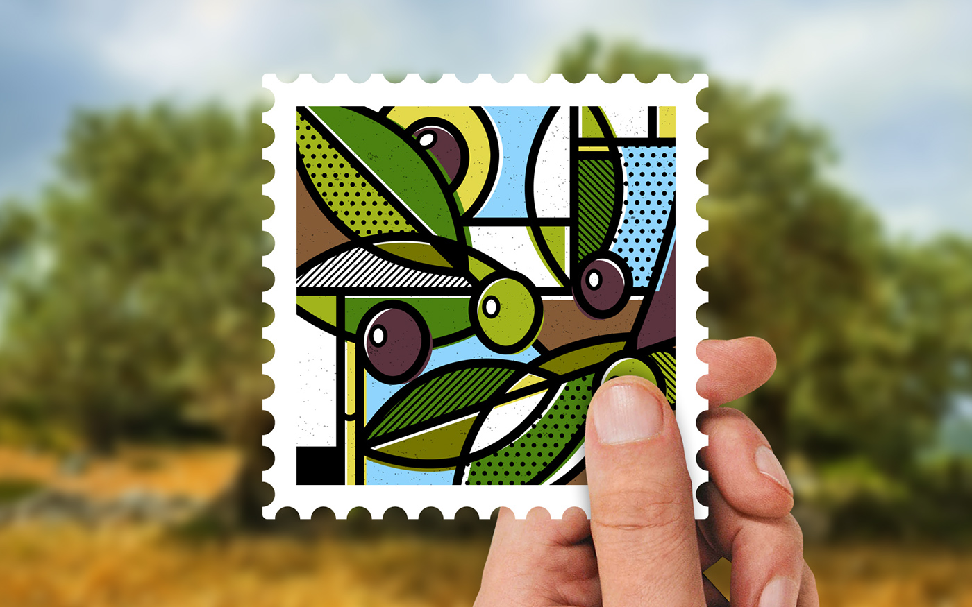
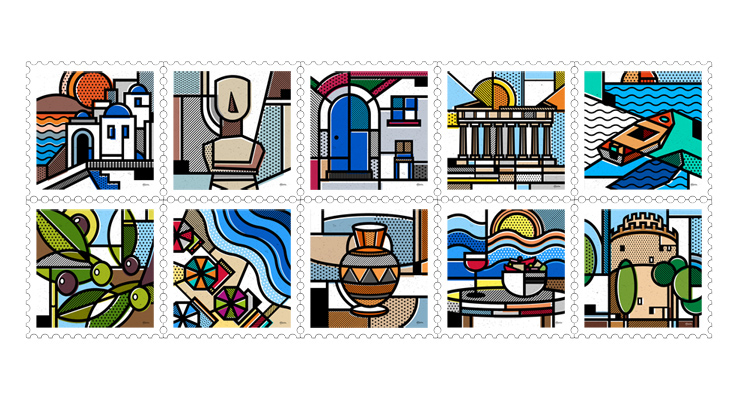
I love this stamp collection by Athens-based graphic designer & illustrator Mike Karolos. It is called ‘Destination Greece’ and is a self-initiated project that aims to show – among the economic crisis – the beautiful side of Greece. Karolos has a very distinct graphic style in most of his work, drawing inspiration from abstract and pop-art style.
Can someone turn these into real stamps please? Thank you.
(via)
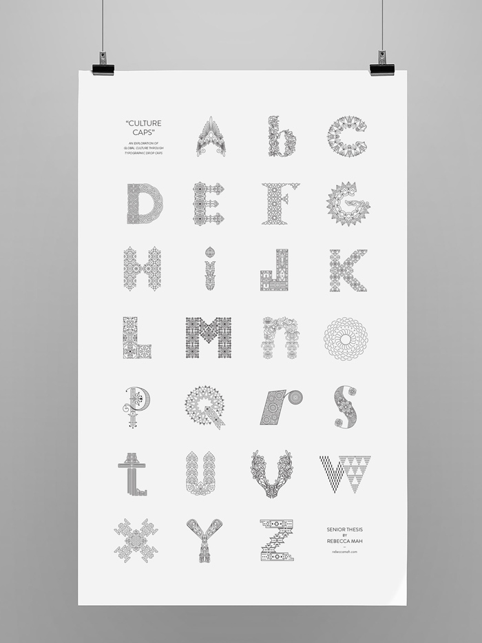
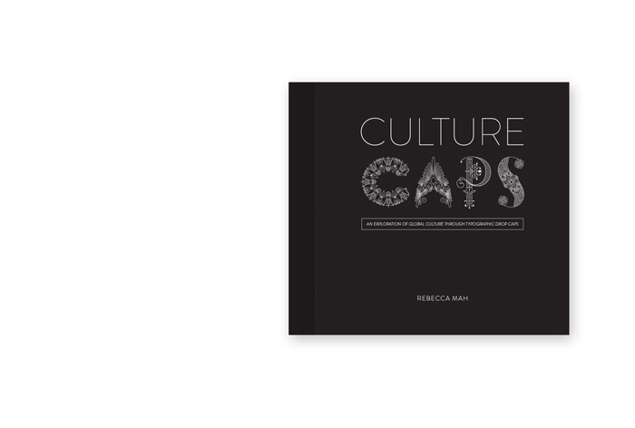
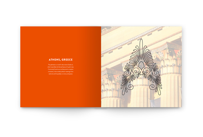
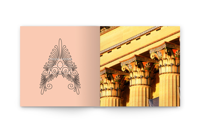
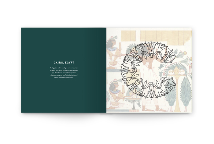
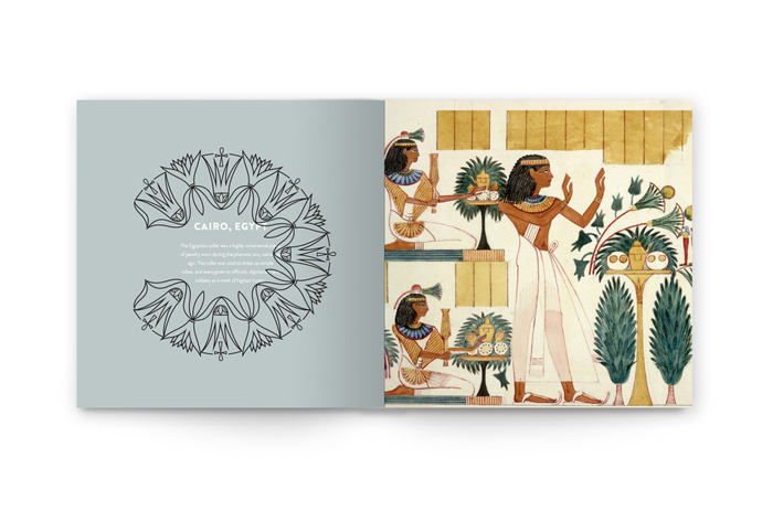
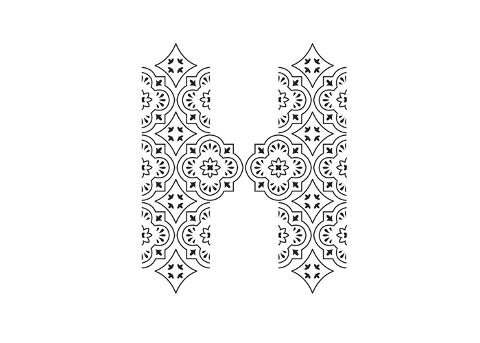
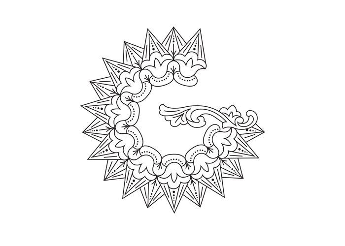
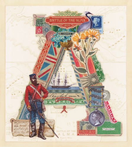
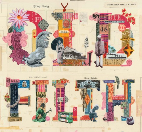
For her senior thesis, graduate Rebecca Mah created Culture Caps, a drop-cap alphabet inspired from different cultures and countries. Each letter incorporates design aesthetics from different parts of the world with great detail and beautiful execution. An excellent breakthrough project for a young designer.
The project also includes a book, a poster, and a website, which unfortunately is under construction at the moment.
(via)

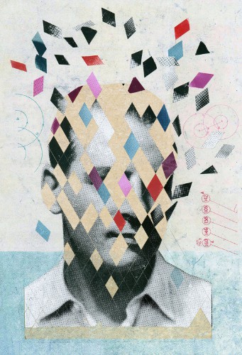


I just discovered Martin O’Neill, a London-based illustrator & artist who creates beautiful collages for publishing, advertising, design & installation work.
In order to create his images he combines collage, silkscreen, photography, paint, and digital techniques. I especially love his type collages, there is so much going on, I wish I had larger photos of his work to be able to see the detail.
More lovely work on his website called appropriately “Cut it out“
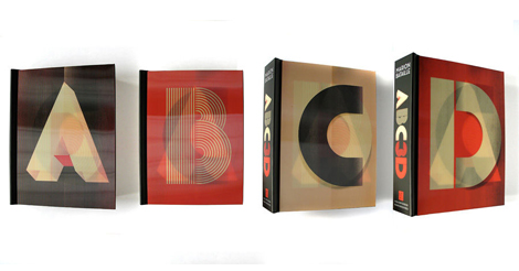
I am in love with a pop-up book!
ABC 3D is created by French graphic designer Marion Bataille, also author of 10, Numero and Livre de Lettres. Actually, I just love all her books: the colors, the clever pop-ups that make one letter dissolve into another… Brilliant!
Also another fun version of the above video, but with a special ABC3D song (created by the band “Not Waving But Drowning”) inspired by the book.
© 2026 Setaprint
Theme by Anders Noren — Up ↑