Category: Graphic Design (Page 4 of 5)

How graphic design production was

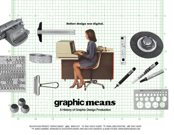
This is a trailer for the documentary, Graphic Means – now in post-production – that explores graphic design production of the 1950s through the 1990s.

Before the computers there was paste-up, scalpel and a lot of Letraset. As a person who remembers some of these tools, this film sounds like a nostalgia trip, but also reminds me how lucky I was, being able to learn and work with a desktop computer from the early beginning.

Rebranding of the Sydney Opera House

SOH new identity Utzon Interbrand Australia Stand Apart

SOH new logo Interbrand Australia Stand Apart

SOH new identity Interbrand Australia Stand Apart

The Sydney Opera House has a super sleek and minimal new identity. Australian agency Interbrand Australia created a complete visual language including a new logo mimicking the shape of the building’s sails and a beautiful 3D typeface called Utzon (named after SOH’s visionary architect Jørn Utzon) which was designed with Studio Laurenz Brunner and reflects the contours of the iconic building itself.

(via)

Space tourism posters for NASA

nasa grand tour print

nasa Mars print

nasa enceladus print

How often can you get a commissioned project by NASA?

These beautiful retro-style posters were designed by Invisible Creature, two award-winning brothers from Seattle. They were commissioned by NASA’s Jet Propulsion Laboratory to design a set of “travel posters”, that would be part of a 2016 calendar, and was given as a gift to JPL and NASA staff, as well as engineers, government and university staff.

The designers were not just lucky. Their grandfather was an illustrator and graphic designer at NASA for over 30 years, so this project was obviously a special one.

Some of the limited-edition prints from the designers are sold out, but the designs are available here to download for free. I already downloaded mine!

(via)

Moving typeface for AIA

natasha-jen-moving_typeface AIA

natasha-jen-invite_AIA

Pentagram partner Natasha Jen and her team designed a cool typographic identity for the American Institute of Architects’ ball. It includes a playful and flexible typeface called Herita-Geo, which expands and contracts depending on its usage, inspired by the way architecture responds to available space.

(via)

« Older posts Newer posts »

© 2024 Setaprint

Theme by Anders NorenUp ↑