
We just finished watching The Queen’s Gambit in Netflix and I was so impressed by the cinematography, costumes, sets and the overall impeccable production design and styling. The last time a series’ art direction and design made such an impression on me was when I watched Mad Men.
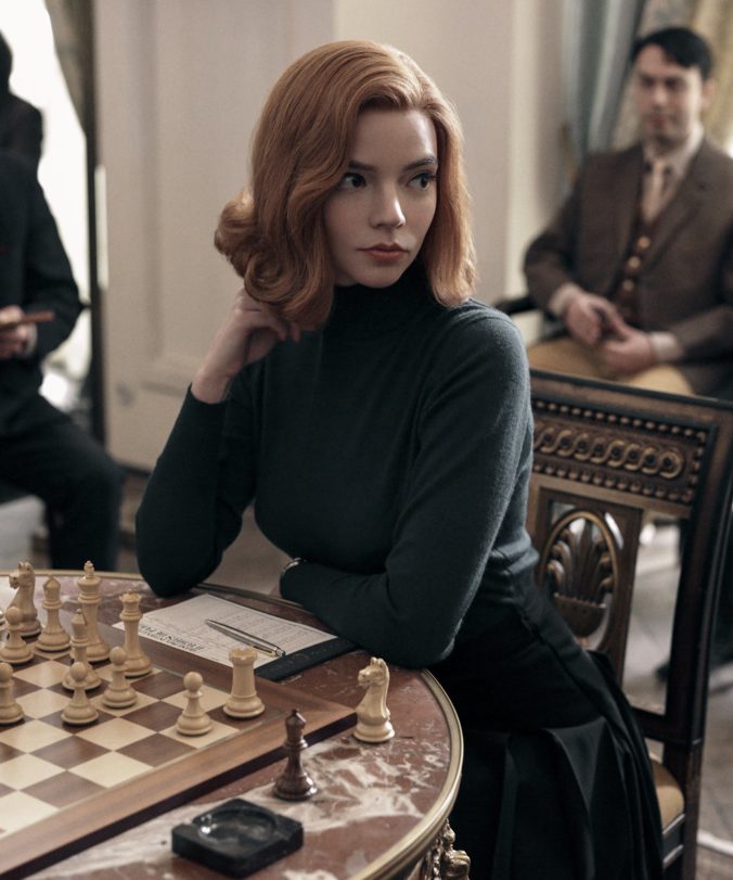
The show is situated in the 1950s and ’60s as the story’s fictional heroine Elizabeth Harmon (Anya Taylor-Joy) — a brilliant yet self-destructive chess prodigy raised in an orphanage — rises to international fame.
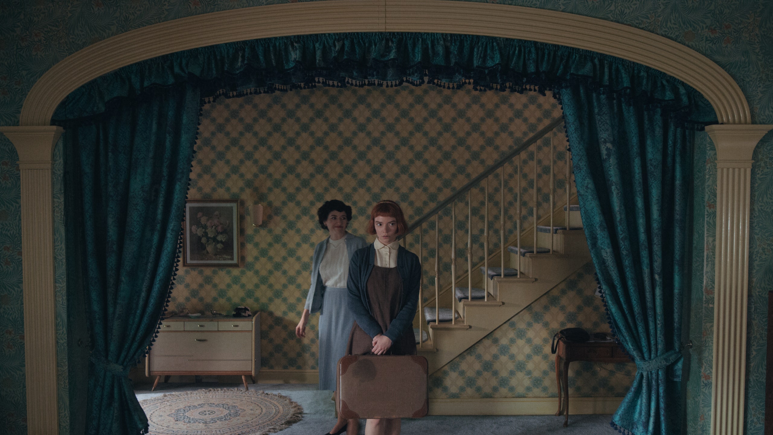
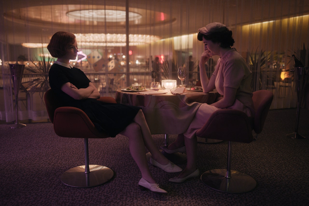
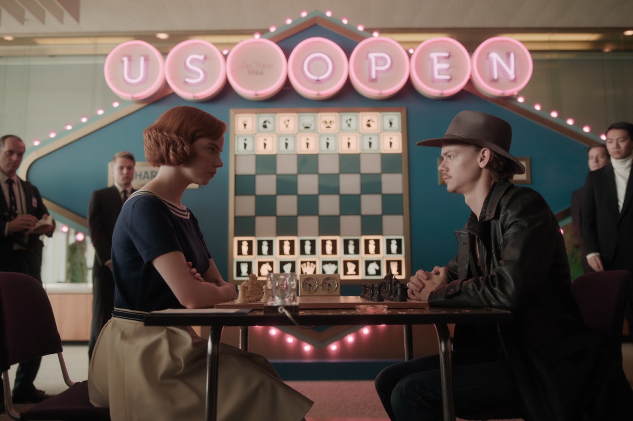
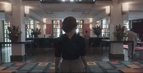
The show’s production designer Uli Hanisch is behind the sets, whether it’s the orphanage, or the traditional mid-century-modern home, or the glamorous chess-tournament events hosted in Las Vegas, Paris and Mexico City. Everything is palette-matched and perfect. Special mention will have to go to the full-pattern and colourful wallpapers inside the Wheatley home.
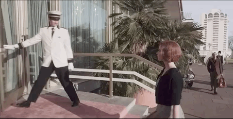
It is interesting that, while the story spans the globe, most of The Queen’s Gambit was shot in Berlin, even the Aztec Hotel chess tournament which is supposedly based in Mexico City.
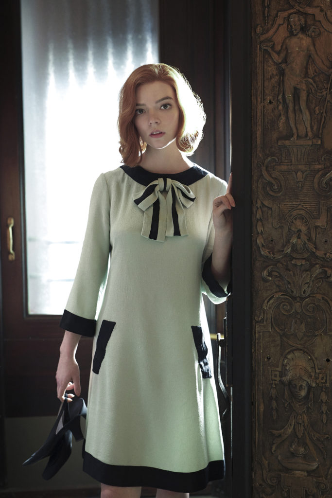
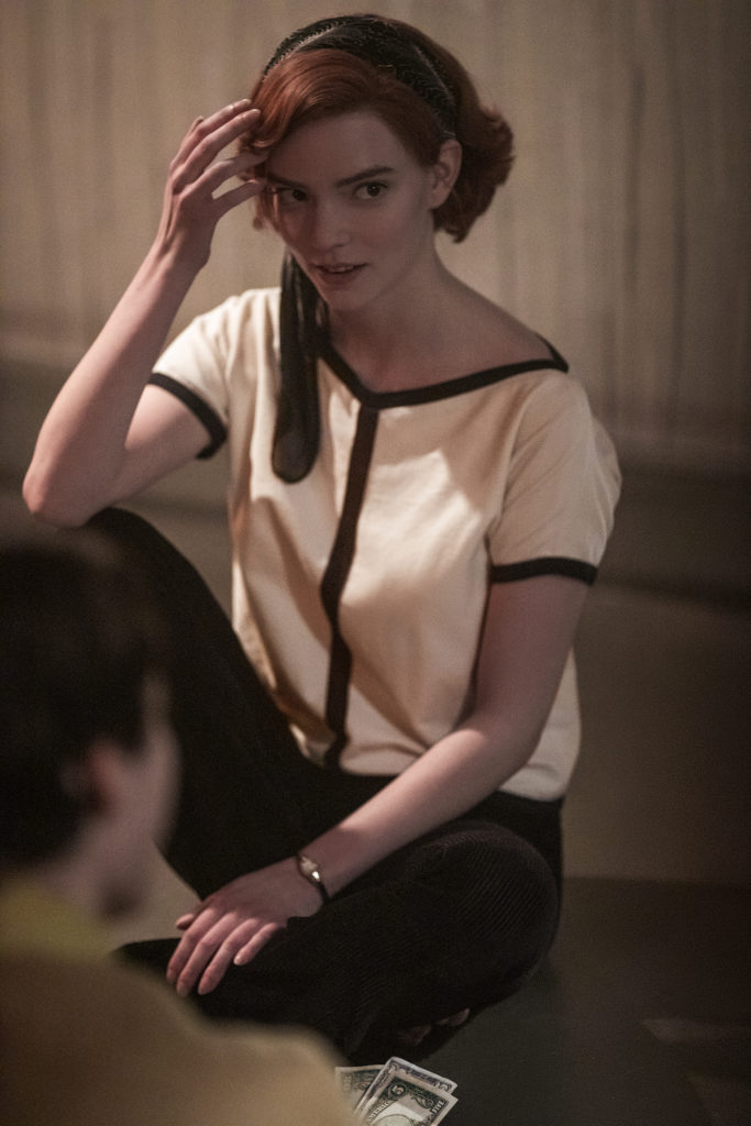
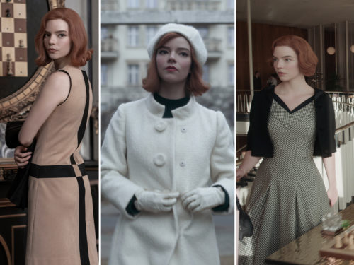
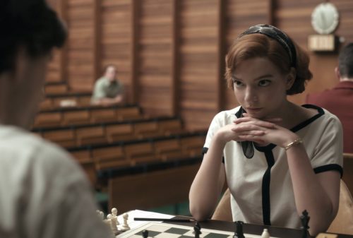
Designed by Gabriele Binder, costumes for The Queen’s Gambit reflect the growing sophistication and self-assurance of the main character, often incorporating structural lines and black-and-white patterns, taking inspiration by chess colours, while paying homage to Pierre Cardin, Courrèges and the Mod style of the era.
A very interesting (virtual) exhibition of the costumes included in the series is presented in “The Queen and The Crown” by the Brooklyn Museum.