![]()
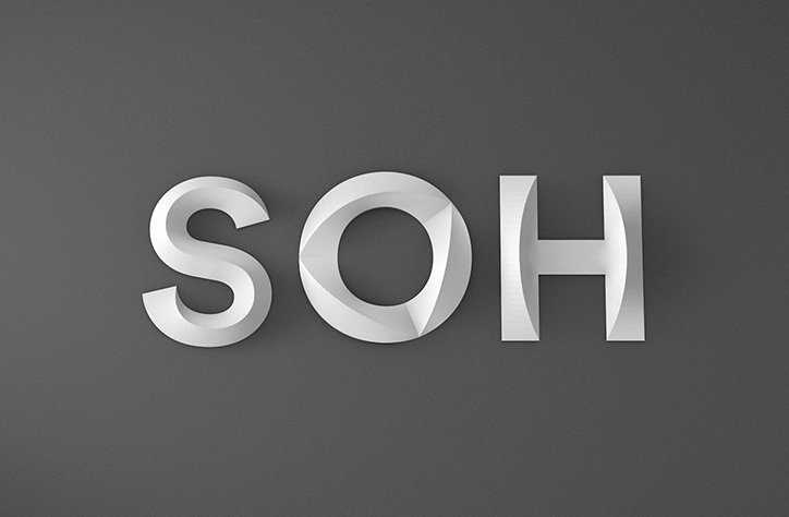
The Sydney Opera House has a super sleek and minimal new identity. Australian agency Interbrand Australia created a complete visual language including a new logo mimicking the shape of the building’s sails and a beautiful 3D typeface called Utzon (named after SOH’s visionary architect Jørn Utzon) which was designed with Studio Laurenz Brunner and reflects the contours of the iconic building itself.
(via)
Leave a Reply