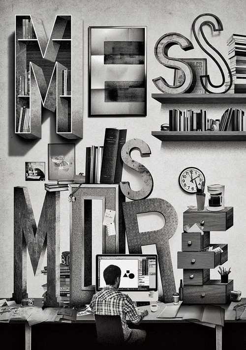
Mess is more: Illustration commissioned by Uppercase magazine

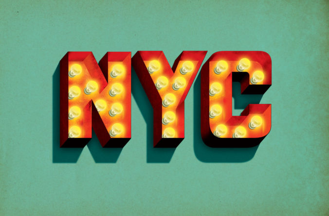
NYC in lights: Originally created for a design exhibition in Texas
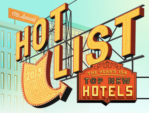
Hot List: Illustration created for Conde Nast
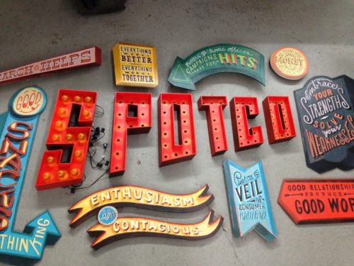
Spotco: Three-dimensional parts of a piece of lettering art for a company entrance
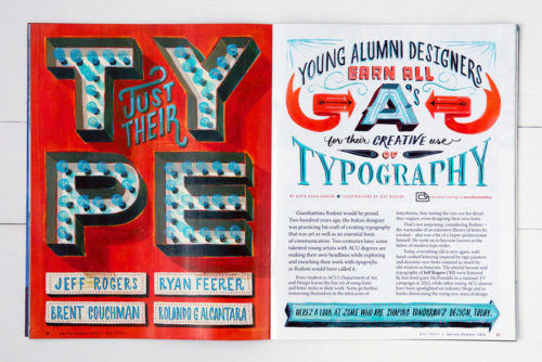
ACU Today: Lettering for editorial design
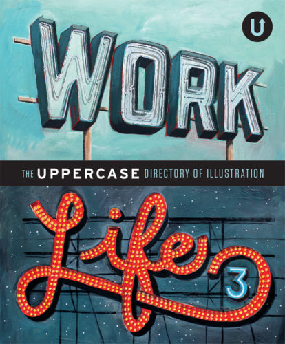
Work/Life: Cover illustration for a book
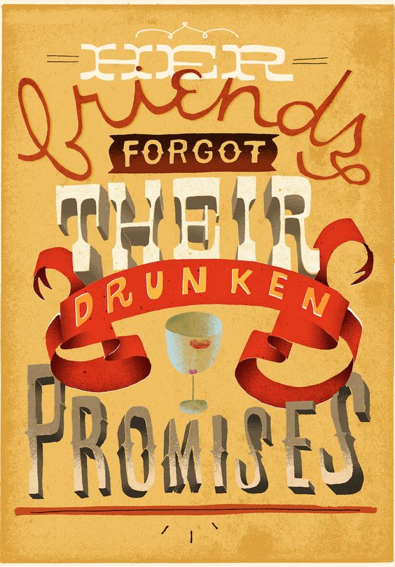
Lettering for a “story with 6 words”
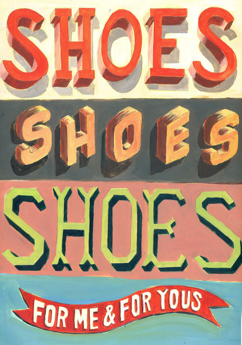
Shoes: Painting inspired by vintage dimensional type specimens
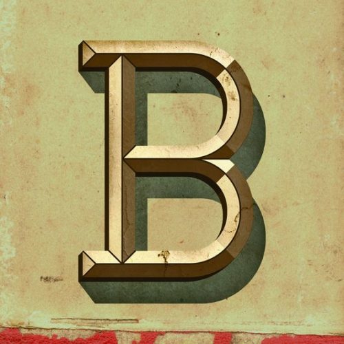
Letter B – inspired by vintage dimensional type specimens
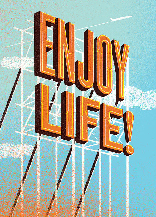
Enjoy Life: illustration created for a custom company book
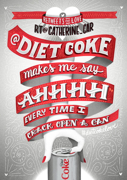
Retweets of love: Promotional design for Diet Coke
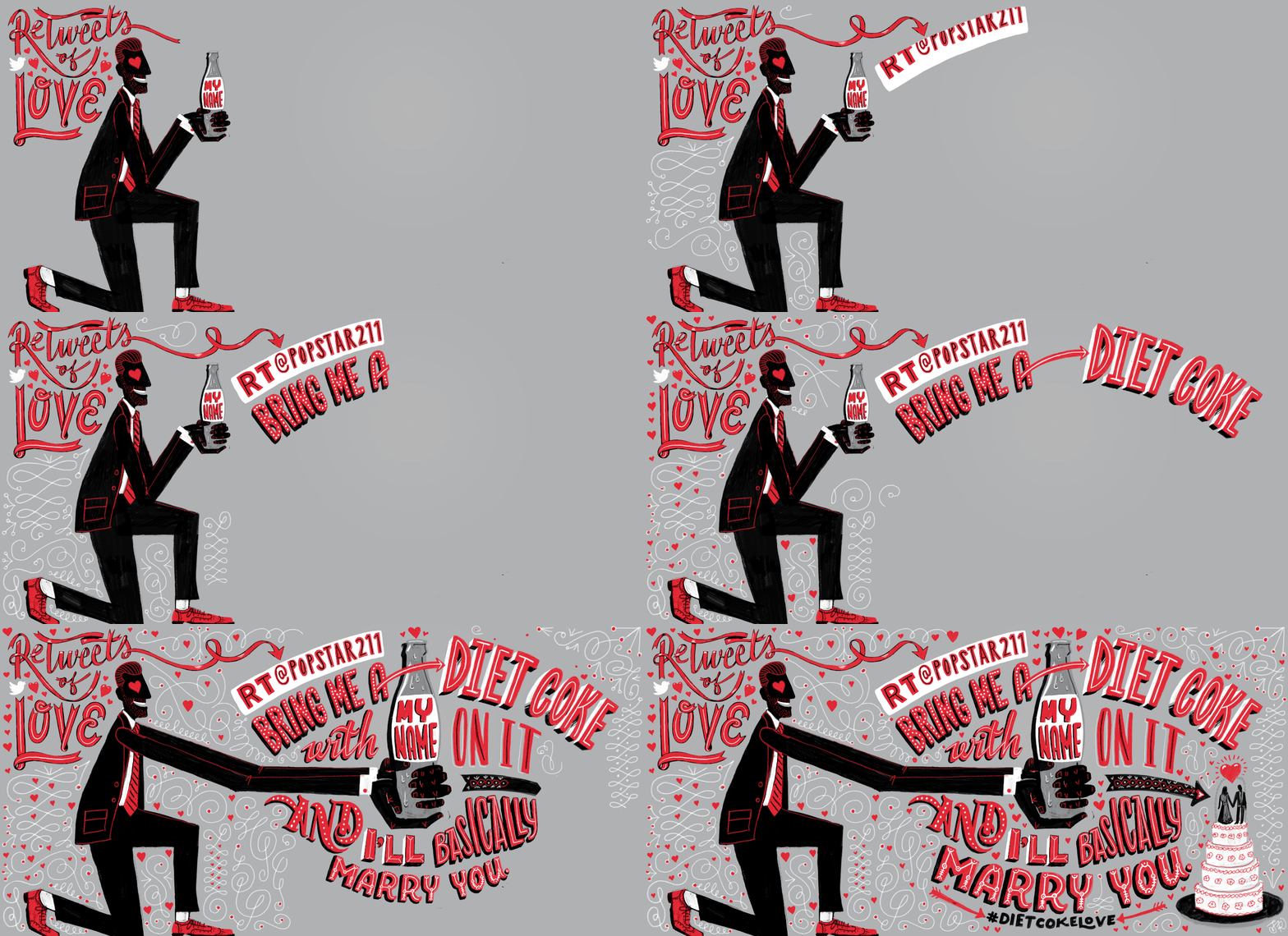
Retweets of love: Promotional design for Diet Coke

Wells Fargo Mobile Banking: A series of animations for social media.
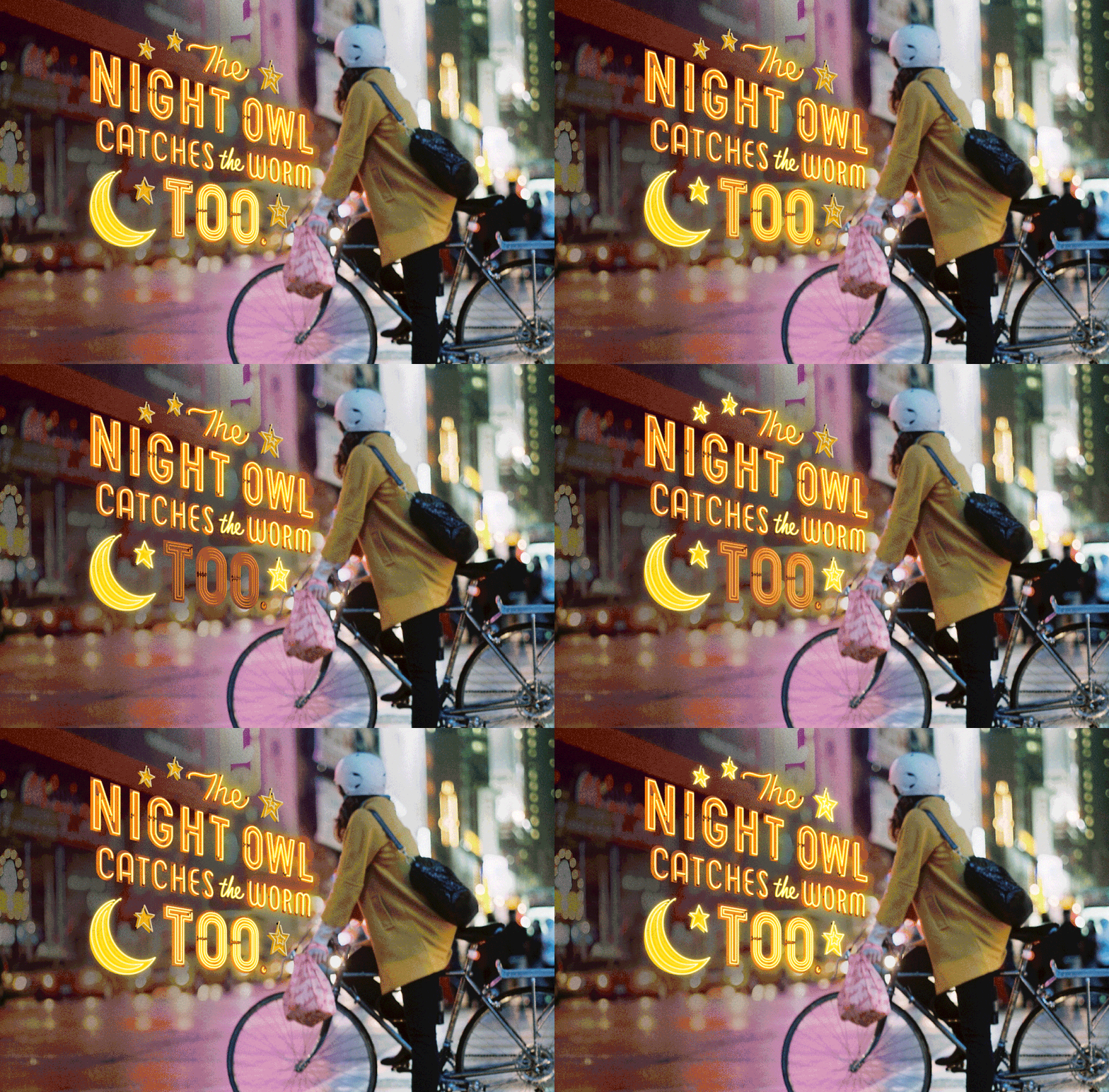
Wells Fargo Mobile Banking: A series of animations for social media.
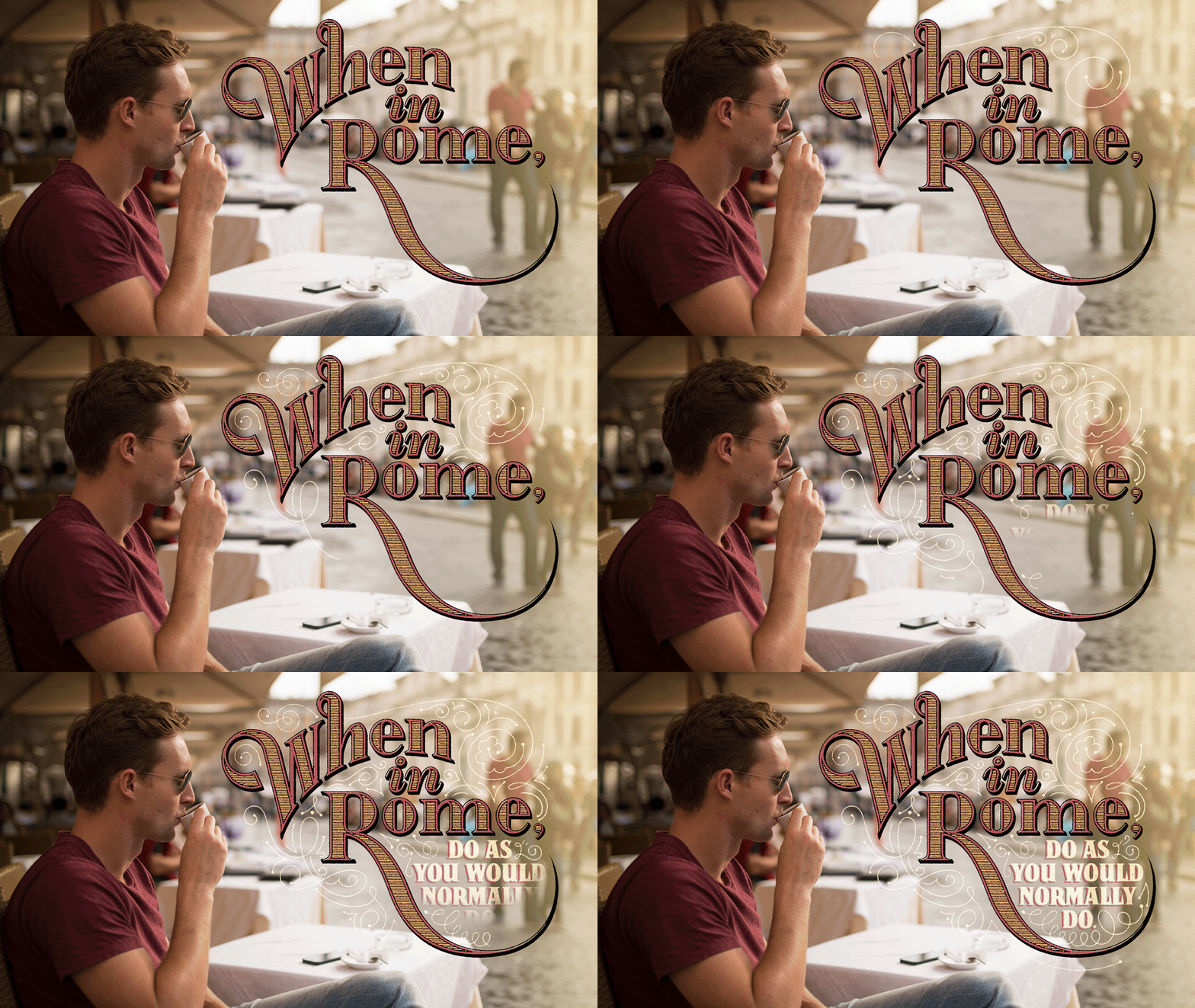
Wells Fargo Mobile Banking: A series of animations for social media.

Wells Fargo Mobile Banking: A series of animations for social media.

Wells Fargo Mobile Banking: A series of animations for social media.
Just discovered Jeff Rogers, a New York City-based designer and letterer. He has a very distinct style of lettering which I love! He uses a combination of hand-drawn and digital techniques depending on the project, while having a very broad range of styles in his work.
He usually begins with pencil sketches and then, often, moves on to the computer to make vector outlines and add texture and color. In other cases he draws or paints by hand, creating a beautiful retro style reminiscent of vintage painted signage. He also plays around with sculpted letterforms by creating three-dimensional handmade letters.
Also, really amazing work with the GIF animations!



Leave a Reply