I love beautiful stationery and I thought it may be worth writing a post about my research for the perfect planner for 2019.
You see, I am old-school when it comes to stationery and I still use an analog planner for my everyday planning of my endless lists. For years, I used Filofax personal organizers, where I wrote my to-do lists and when I carried out my tasks, I took a certain pleasure in crossing them off with a black marker. In the end of each year I just discarded my old and used planner to replace it with a new one.
Inspiration
That is until I stumbled upon the concept of bullet journals and at the same time I discovered South Korean stationery! The whole idea was that the information entered in the planners could be organized better, while it could also look much better. As a result I could keep these beautiful planners as keepsakes. Of course, bullet journals were maybe too much for me, but I liked the idea of trying to make my planners more presentable and not a bunch of crossed-out lists.
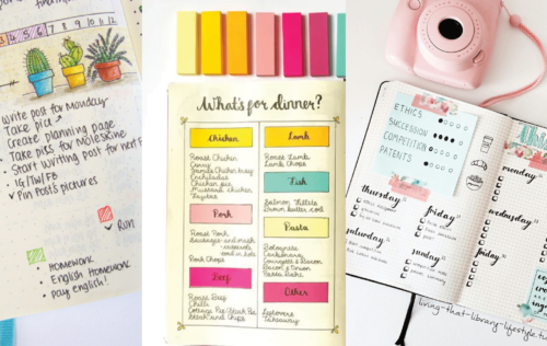

Examples of bullet journals
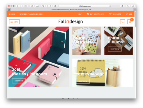
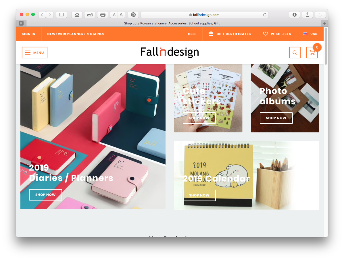
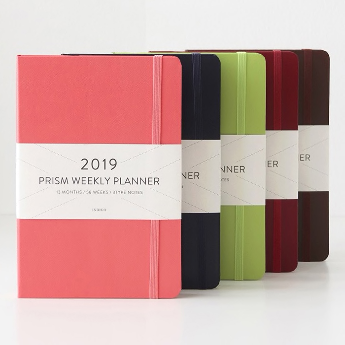
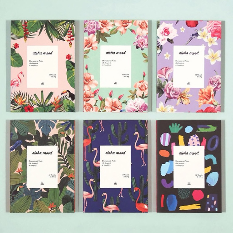
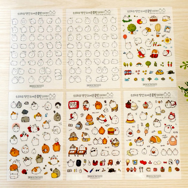
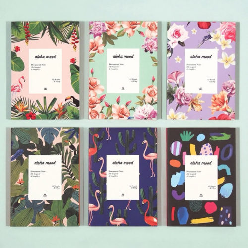
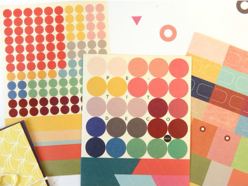
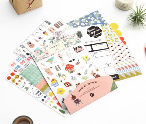
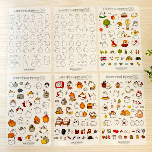
A South Korean stationery online shop
How it all started
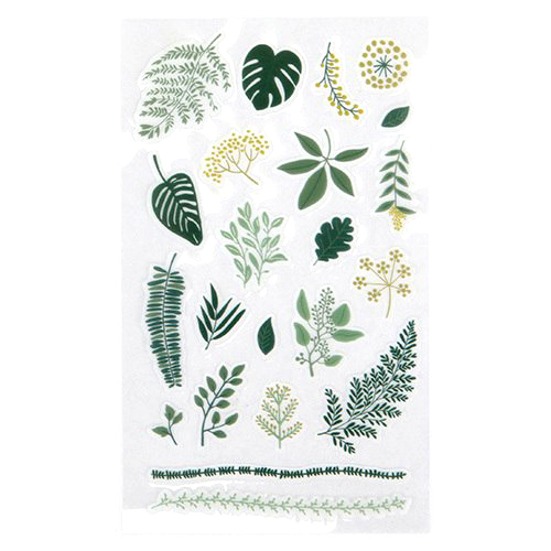
My research started in a South Korean stationery shop called Fallindesign. They have hundreds of beautiful journals, diaries and planners, with monthly, weekly or daily schedulers, either dated or undated. They come with cute stickers for grownups, which you can use to label each task accordingly. The only downside is that, they are not cheap and delivery takes a long time from S. Korea.


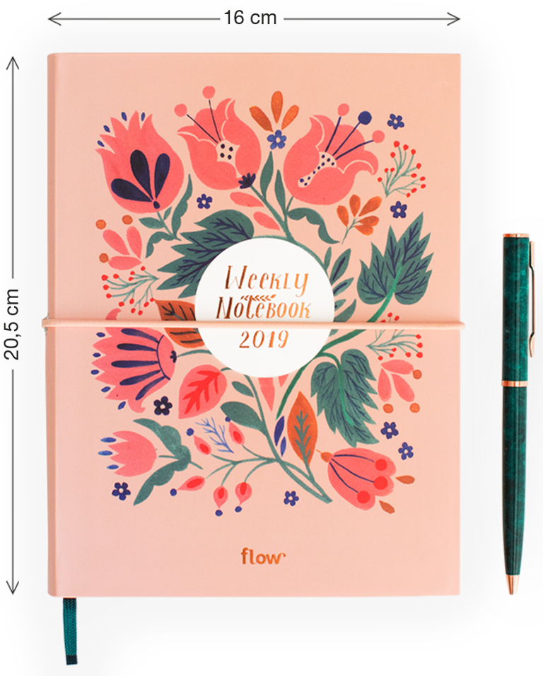
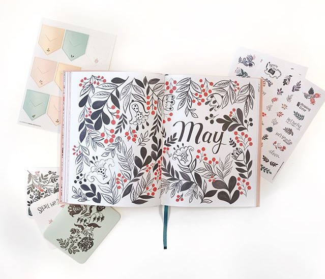
Go with the Flow
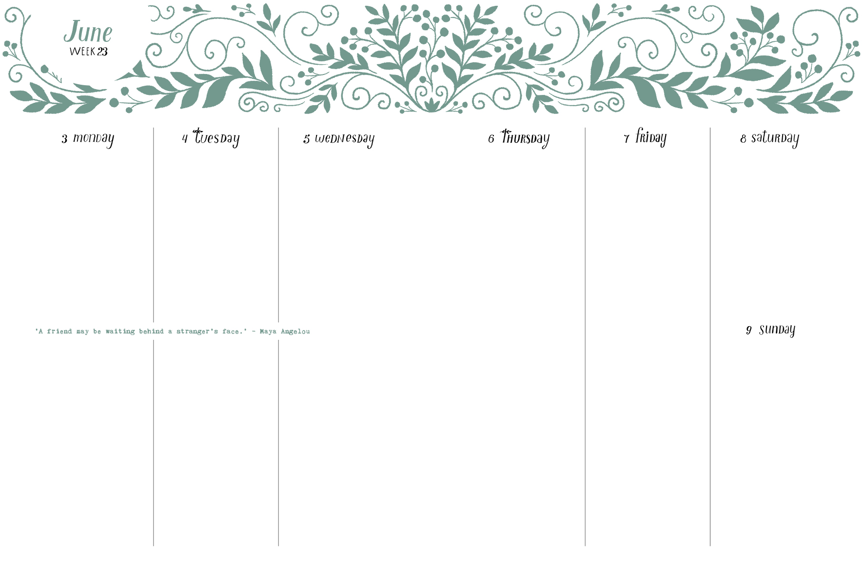
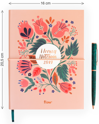
I was specifically looking for a well-designed weekly planner, but with extra space for notes. Another great product (in the South Korean style) that met my specifications is the Flow diary 2019. Great design, beautiful illustrations and hand-lettering, together with special stickers. But unfortunately it doesn’t have enough space for my lists.

More minimal maybe
After I selected a few items as a short list, I decided to look for planners with a more minimal design. I ended up with two very similar items.
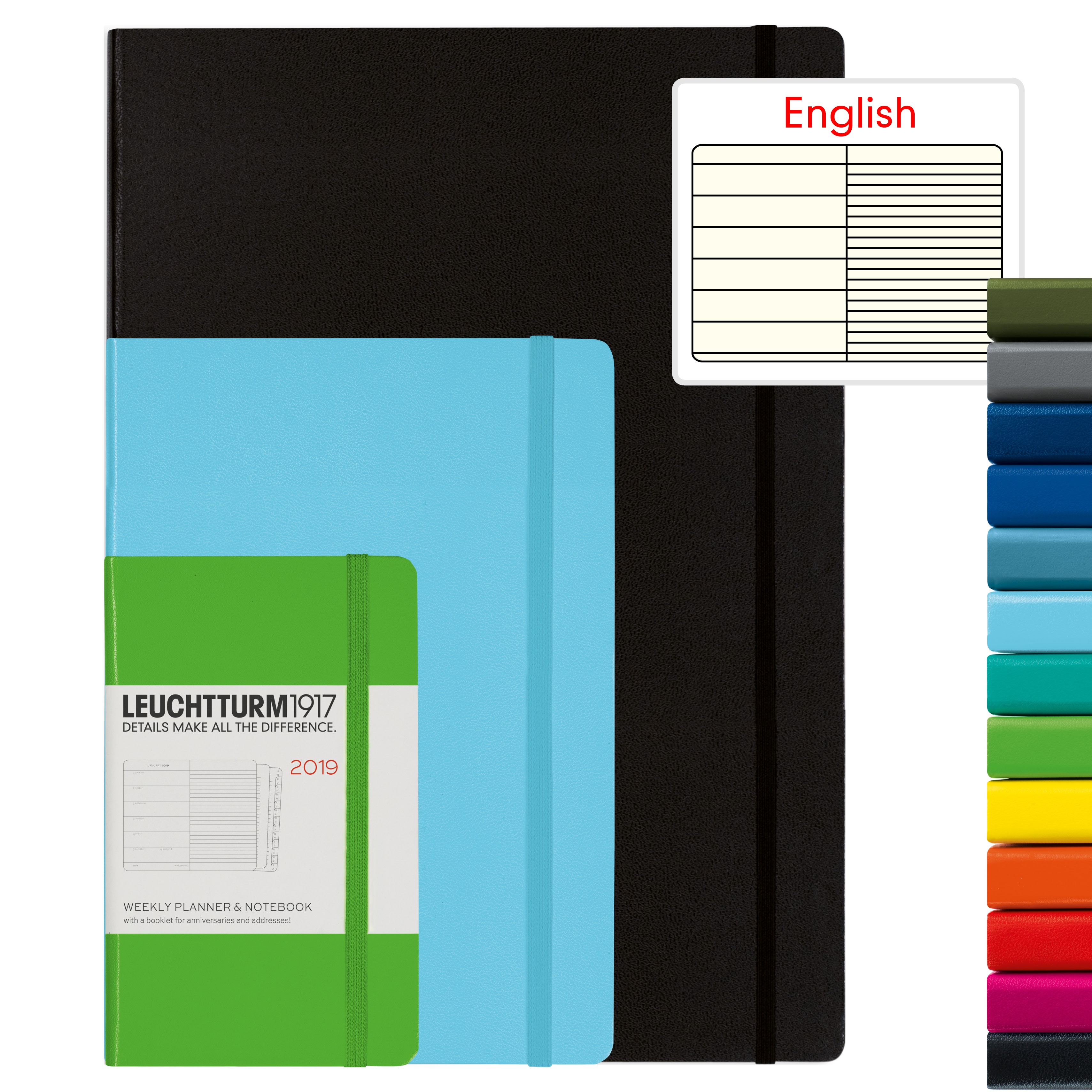
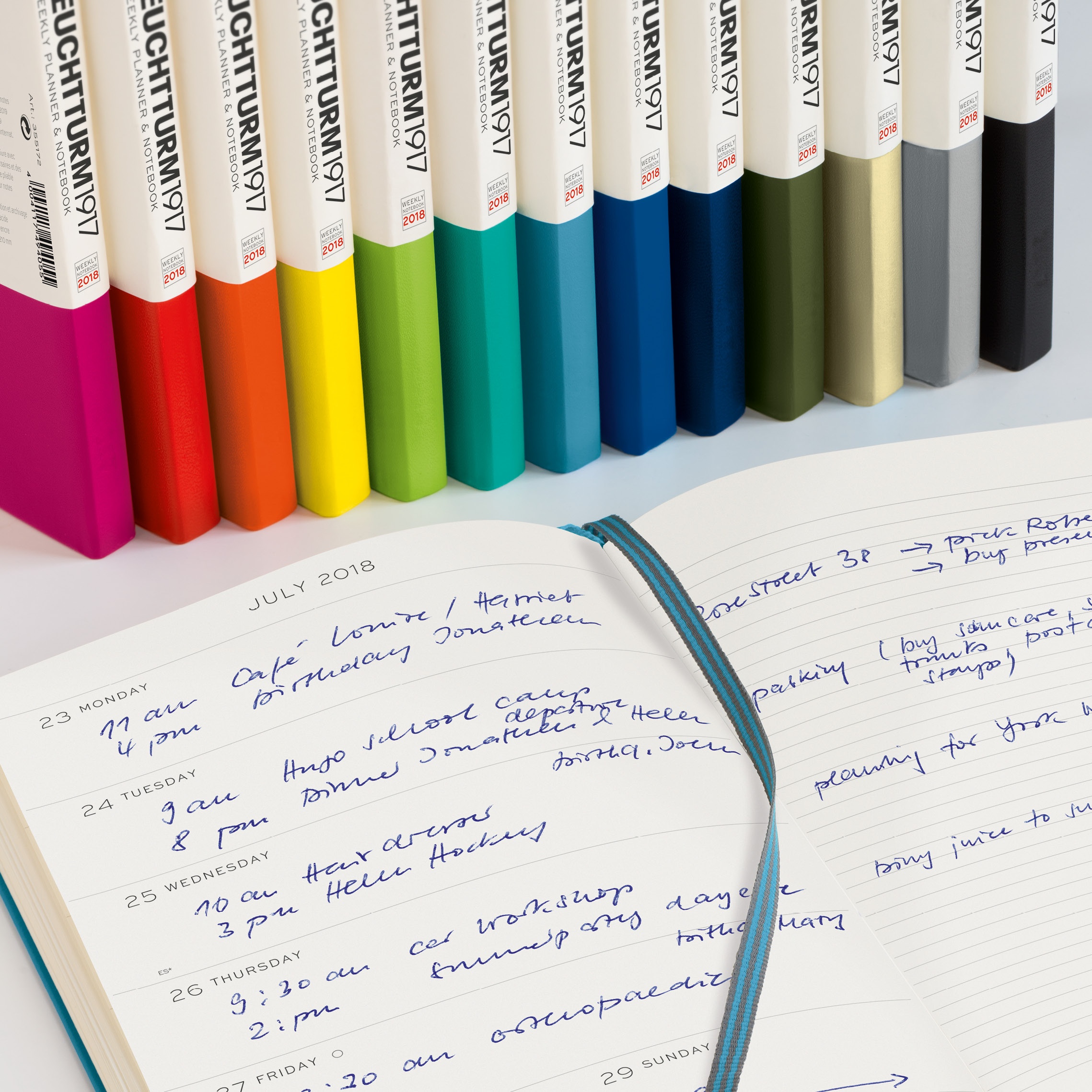
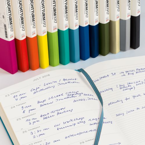
One is the LEUCHTTURM1917 weekly planner and notebook, that features great colour choices for the cover and has a week shown on one page with an extra ruled notebook page on the other.
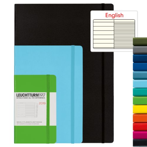
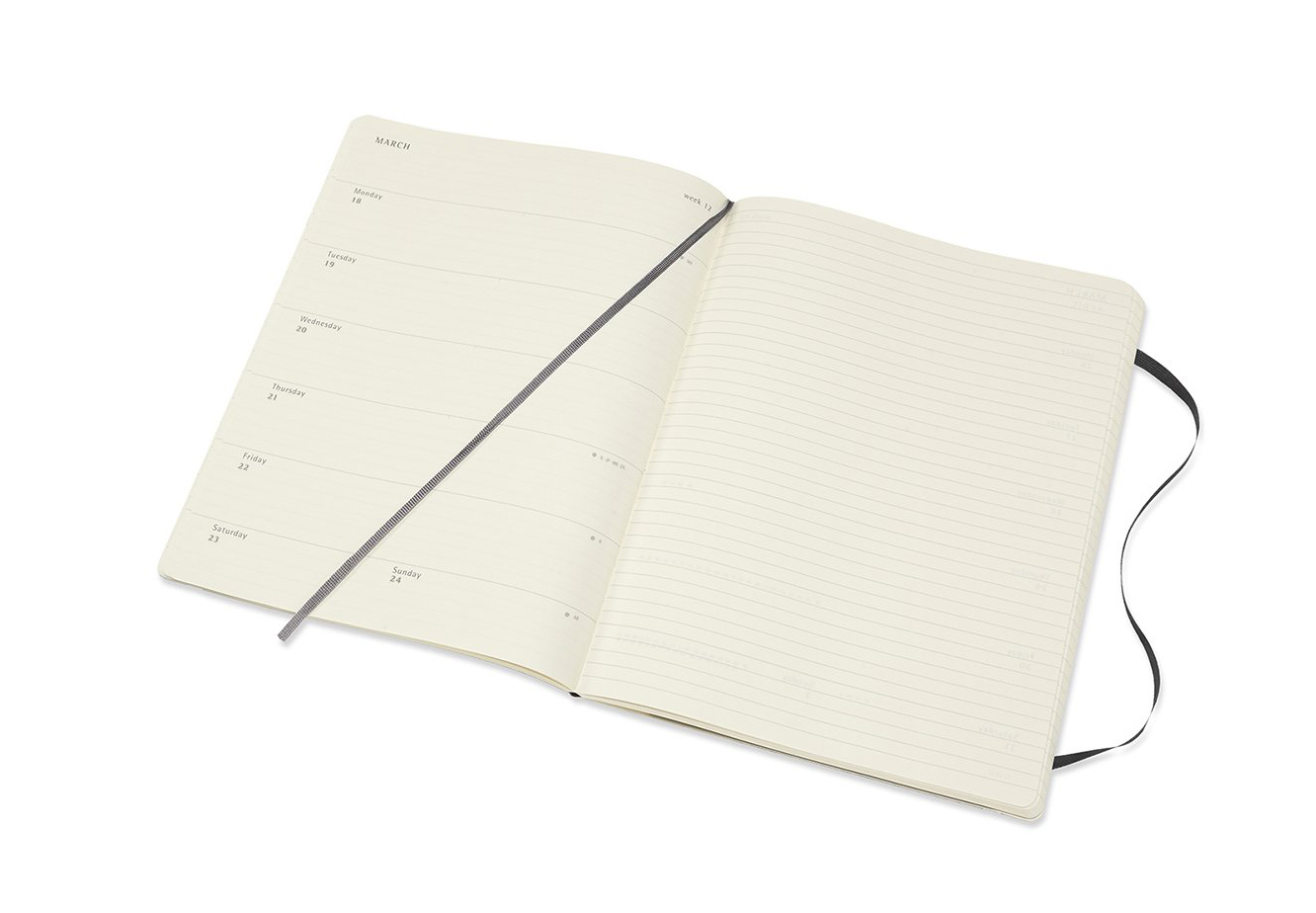
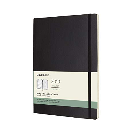
The other very similar planner is the Moleskine 12 Months Planner Weekly Notebook. It is conveniently formatted to show the week’s appointments on the left and a ruled page for notes on the right, but was soon rejected as a little boring.

The best choice for me
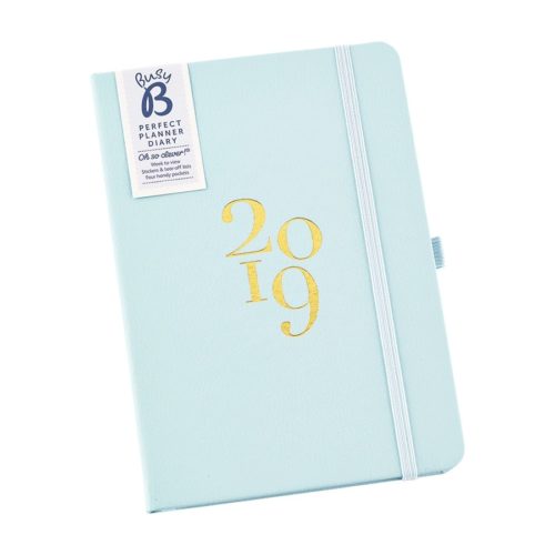
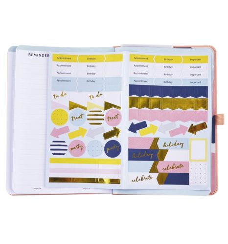
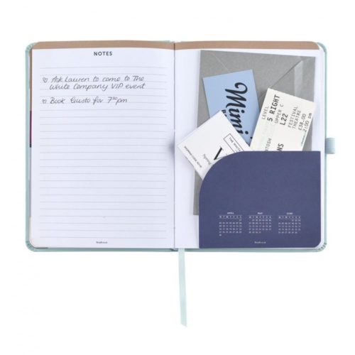
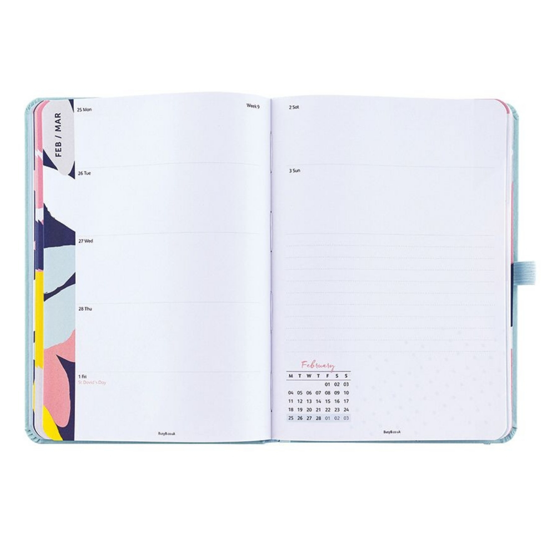
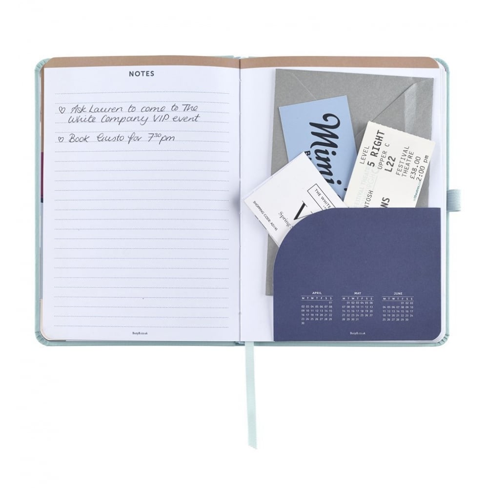
In the end, I found my “perfect” planner amongst the choices of the excellent Busy B online shop. The Perfect Planner Diary 2019 shows one week to a spread, with space for notes, and is also a great size, not too big and not too small. It has great design and paper quality with many-many extra little details (four pockets, tear-out reminder lists, great-looking stickers and a removable notepad). Τhe good price and the very fast delivery are extra bonuses.